
The map above visualises the percentage of households that have access to drinking water within the premises as found in the National Sample Survey's 69th round (2012).
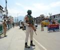
'Nobody can control Kashmir and what happens here.' 'Even a government with a full sweeping majority and strong mandate hasn't been able to control the state.'
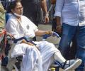
The BJP which won only three seats in the last assembly election is looking confident to make inroads is Mamata's den.
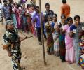
Move the pointer on the sentiment meter (depending on who you think will get more votes) towards the political parties to see how the outcome is likely to change.

The ratio of male to female divorcees varies widely across India.

Take the rediff business quiz and see how much you know about India's pharmaceutical industry.

This map shows the districts of India with their encroachment levels.

You don't prep for 2028 but for 2040, or even 2044. Sustained sporting excellence is based on mass support, grassroots development, and funding - and it is this trifecta India needs to work on, systematically, asserts Prem Panicker.
The map below shows the classification of this score into Mostly Dirty, Somewhat Clean and Mostly Clean.

'An in-house contest encourages employees to share yoga and well-being practices with their families.'

Click on the map to see the quantum of reservation across all our states.

Move the slider on the map above to see the change in percentage of target achieved in collection of donated eyes over the years ranging from 2007-08 to 2014-15.

A map showing the 50 deadliest air crashes and the number of fatalities in the last five decades

Get a new QR code from an alternative provider. PhonePe, Google Pay, Pine Labs, etc are some of the other service providers.

'We want to make sustainability affordable.' 'We tell everyone, don't just recycle, Craste it!'

The map above shows the percentage of people around the world who tend to, on a regular basis, consume excessive food as compared to their personal energy requirement.

The infographic shows the total number of lives lost in India in natural disasters since 1990

Prabhas may be the face of Kalki 2898 AD's heroics but the real bang for your buck is delivered in Amitabh Bachchan's indefatigable energy providing Kalki's biggest wolf-whistle moments, applauds Sukanya Verma.
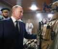
With the fight now having been taken to the seizure of nuclear plants, it is one more warning to Europe that this prolonged war could end up with disastrous consequences, observes Rashme Sehgal

'We first collected samples from all the bomb blast sites.' 'We had to find what was common among them.'

Rediff Labs analysed the data on MPLADS to see how the money given to each constituency was spent.

The map shows the change in HIV deaths per 100,000 population over 2005, 2009 and 2013.

The map, above, shows us the number of road accidents per one lakh people, represented by the size of the circle and its severity (deaths per 100 road accidents).
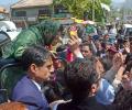
'Whether she is in power or not, she always makes it a point to visit us. This is her best quality as a leader.'

Rediff Labs analyses the relationship between alcohol and revenue generated and reported drunken driving accidents.

A map showing the gender equality across the world as published in the 'Global Gender Gap Report 2014' of the World Economic Forum.

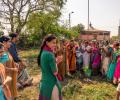
Each bottle of pickle that leaves FarmDidi, headed to a consumer, has a little kahani behind it -- it's linked to the tale of a life, the life of a simple, striving village woman who created it, and that's what gives Manjari Sharma satisfaction and happiness.

Rediff Labs investigates the issue of child drug abuse in India in an attempt to quantify the seriousness of the issue.

Stories are legion about the Karatmeter's use at that time. Hundreds of people standing in queue for testing, customers breaking down after discovering the actual purity of their jewellery and then becoming irate about the jeweller who had gypped them, the local jewellery industry leaning heavily on the Tanishq franchisees to desist from using it, some jewellers even threatening violent action.
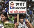
The map shows the state wise rate of crime/atrocities committed against SCs by non-SCs in 2016.
Explore the interactive map above to see the working children per 1000 population and the percentage change over the period from 2001 to 2011.

An infographic showing the mortality per 1,00,000 population figures for four of India's deadliest diseases as reported by the World Health Organisation.

Most of the pharma units are failing in documentation, and validation processes, and many don't have full-fledged quality control laboratories.

The graphic above shows the number of heat wave deaths in India each year since 1967.

A map showing the rate of insult to women's modesty as reported in 2014 in Indian cities.

The map above shows the disparity in Monthly Consumer Expenditure as reported by the 68th round of National Sample Survey.
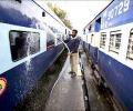
Railway stations -- Beas, Vishakhapatnam, Khammam, Secunderabad, Ahmednagar and Jammu Tawi are the top ranked railway stations by cleanliness.
As per the 64th round of the National Sample Survey, nearly 29 per cent of Indians had relocated in the last 365 days.
Could a grand alliance between the Samajwadi Party, Bahujan Samaj Party and Congress -- built along the lines of the successful Bihar mahagatbandhan of 2015 -- have changed the outcome of the Uttar Pradesh election?
